

I repainted my living room three times in two years before I figured out what I was doing wrong. Not the paint. Not the brand. The problem was that I picked colors one room at a time, based on whatever I liked in the moment, with zero plan connecting them. The hallway didn’t talk to the kitchen. The kitchen argued with the living room. By the third repaint, I sat down and actually built a color scheme before touching a paintbrush, and the difference wasn’t subtle — it was a house that finally felt like one place instead of five arguments.
That’s really what this article is about. Not “here are some pretty colors,” but how to choose a color palette for your home in a way that holds up once the furniture’s in, the light changes with the seasons, and you’re not standing in a paint aisle under fluorescent bulbs anymore.
What a Color Scheme Actually Is
Let’s start with the color scheme definition, because people throw the term around loosely. A color scheme is a planned combination of colors used together based on their relationship on the color wheel — think of it as the rulebook, not the paint itself. A color palette, by contrast, is the actual set of specific shades you’ve chosen: your particular greens, your particular white, your particular accent tone.
So when someone asks “what is a color scheme,” the short answer is: it’s the structural logic behind why certain colors work together, while a color palette is the specific application of that logic to your space. You need both. A scheme without a palette is just theory. A palette without a scheme is guesswork.
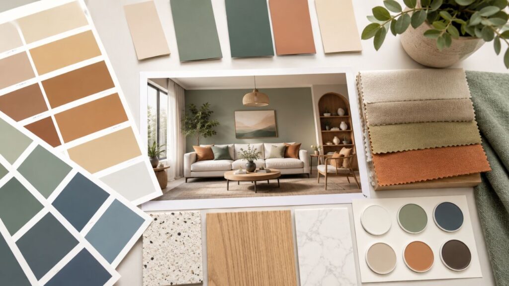
Types of Color Schemes You’ll Actually Use at Home
There are more formal color theory categories than most homeowners need, but a handful come up constantly in interior design color schemes. Here are the different color schemes worth knowing, with color scheme examples for each.
Monochromatic Colors
Monochromatic colors use a single hue in a range of tints, tones, and shades — light sage to deep forest green, for instance, all in the same family. It’s the safest route to a cohesive color scheme because you’re not juggling contrast at all, just depth. A bedroom done entirely in warm greiges, from the ceiling down to the linen, is a classic monochromatic move, and it’s forgiving if you’re not confident mixing colors.
Analogous Schemes
These use colors sitting next to each other on the wheel — blue, blue-green, and green, say. They read as calm and connected, which is why so many coastal and Scandinavian-style homes lean on them.
Complementary Schemes
Colors opposite each other on the wheel: navy and terracotta, mustard and violet. These create the most visual energy and are best used with restraint — one dominant color, one accent, rather than a 50/50 split that can feel busy.
Neutral-Led Schemes with an Accent
This is the quiet workhorse of most homes: a neutral base — white, greige, warm taupe — carrying 80 percent of the space, with one or two accent colors doing the rest of the work through pillows, art, or a single painted wall.
| Color Scheme Type | Best For | Risk Level | Example Pairing |
|---|---|---|---|
| Monochromatic | Bedrooms, small spaces | Very low | Sage, moss, forest green |
| Analogous | Living rooms, open-plan homes | Low | Blue, teal, seafoam |
| Complementary | Statement rooms, dining areas | Medium-high | Navy and terracotta |
| Neutral + accent | Whole-house cohesion | Low | Warm white, walnut, rust |
If you’re stuck for color scheme ideas, start with whichever row matches how bold you actually are, not how bold you wish you were. A lot of paint regret comes from choosing a complementary scheme because it photographed well online, then living with it daily and finding it exhausting.
Should Your Whole House Have the Same Color Scheme?
This is one of the most common questions I get, and the honest answer is: not exactly, but closer than you’d think. Should your whole house have the same color scheme in the sense of every wall being identical? No — that gets flat and a little institutional. But your home color palette should share a spine. Pick three to five colors total for the entire house, then let each room use a different proportion of them.
A cohesive color palette doesn’t mean matching. It means related. Your kitchen might be 70 percent warm white and 30 percent sage, while your bedroom flips it to 70 percent sage and 30 percent warm white plus a rust accent that also shows up as a single throw pillow in the living room. Walk from room to room and nothing should feel like a hard stop. That’s the test for cohesive colors — not sameness, but continuity.
I’d add one caveat from experience: open-plan homes need this discipline more than homes with lots of closed doors. If your kitchen is visible from your living room, treat them as one color decision, not two.
How to Pick a Color Palette for Your Home, Step by Step
Here’s the process I actually use now, and the one I wish someone had handed me before my first repaint.
1. Start with what you’re not changing. Flooring, countertops, big furniture pieces you’re keeping — these dictate your undertones whether you like it or not. A palette that ignores your existing oak floors will fight them for years.
2. Pick one anchor color. This is usually your wall color or your largest neutral. Everything else gets chosen in relation to it.
3. Add one supporting neutral. Slightly warmer or cooler than your anchor, used for trim, ceilings, or secondary rooms.
4. Choose one or two accent colors. These carry the personality — a color combination that shows up in textiles, art, and smaller furniture rather than large wall surfaces.
5. Test in your actual light. Paint swatches on foam board and move them around the room across a full day. North-facing rooms mute colors and pull them cooler; south-facing rooms brighten and warm them. This single step prevents more regret than any other on this list.
6. Live with it for a week before committing to a full room. Not a day — a week, because morning light, midday light, and lamp light at night will each tell you something different.
If you’re wondering how to pick colors when everything online looks good but nothing in your actual house does, this is usually the missing piece: colors don’t exist in isolation, they exist in your light, next to your floor, against your furniture.
Good Color Combinations by Room
Different rooms carry different psychological loads, so a color combination that works beautifully in a bedroom can feel wrong in a kitchen. Here’s a breakdown of good color combinations and good color combos I’ve seen actually hold up over years, not just in a single photoshoot.
- Living room: Warm white walls, walnut or oak furniture tones, a deep olive or navy accent chair. Calm enough for daily use, grounded enough not to look sterile.
- Kitchen: Soft sage or warm white cabinetry with brass or matte black hardware, and a single deeper accent — often navy or forest green on an island.
- Bedroom: Monochromatic greiges or dusty blues, kept low-contrast so the room reads as restful rather than stimulating.
- Bathroom: Cool whites or soft blue-greens pair well with natural stone or wood accents, since bathrooms benefit from a slightly cooler, cleaner palette.
- Home office: Deeper, more saturated tones — forest green, deep terracotta — tend to support focus better than pale, airy colors, which is a genuine departure from typical living-room advice and worth trying if your current office feels flat.
- Kids’ rooms: This is where cute color combos and pastel colors genuinely earn their keep — soft yellow with white and a dusty pink, or mint with cream, without tipping into anything too saccharine.
Best Colour Combination Isn’t One Answer — It’s a Framework
People searching for the single best colour combination or best colours are usually hoping for a definitive list. There isn’t one, and any article claiming otherwise is selling a shortcut that doesn’t survive contact with your actual house. What exists instead is a framework: pick an anchor, pick a complementary or analogous partner, keep the ratio roughly 60-30-10 (dominant color, secondary color, accent), and adjust based on your light and existing materials.
That said, some home colour combination pairings do come up again and again in professional interior design because they’re genuinely low-risk:
- Warm white + walnut + sage
- Charcoal + brass + cream
- Terracotta + cream + black
- Navy + white + natural wood
These aren’t rules carved in stone. They’re starting points that rarely go badly wrong, which is exactly what you want when you’re choosing a color palette for the first time.
Digital Tools That Actually Help (and Where They Fall Short)
A color palette generator can genuinely speed up the early stages of choosing a color palette, especially before you’ve bought a single paint sample. Here’s how the popular ones actually compare in practice.
| Tool | Best For | Limitation |
|---|---|---|
| Coolors | Fast, random palette generation and locking colors you like | Doesn’t account for your room’s actual lighting |
| Adobe Color | Building a palette from a photo (like your existing rug or floor) | Steeper learning curve than the others |
| Canva color palette generator | Pulling a scheme from an inspiration image quickly | More geared to graphic design than paint matching |
| Color Hunt | Browsing curated palettes for general inspiration | Palettes aren’t tested against real paint sheens |
Adobe Colors — often searched as just “adobe color” — is particularly useful if you already own a piece you love, like a rug or a piece of art, and want a palette pulled directly from its actual pixels rather than guessed at. Upload the photo, and it extracts a color scheme based on the image’s real values.
None of these tools replace physical paint swatches, though. A color scheme that looks perfect on a backlit screen can shift entirely under your ceiling lights. Use these generators for direction, not for final decisions.
Farrow & Ball and the Case for Paint-Specific Color Schemes
Farrow and Ball colour schemes are worth mentioning separately because the brand built its reputation on a smaller, more curated set of complex, layered colors rather than a massive generic range. Shades like their greens and off-whites are formulated with more depth than standard paint colors, which is why designers reach for them specifically when a room needs a slightly more sophisticated color scheme without going into bold, saturated territory. You don’t need to buy Farrow & Ball to apply the lesson, though: fewer, more considered color choices usually outperform a huge range of options.
Common Mistakes That Wreck an Otherwise Good Plan
- Choosing colors from a screen and never testing in-room. This is the single biggest cause of regret.
- Ignoring undertones. A “white” with a pink undertone will clash badly with a “white” that leans blue, even though both read as plain white in isolation.
- Treating every room as a separate project. This is how houses end up feeling disjointed even when each individual room looks fine.
- Going too trend-driven. Trend colors move fast; paint is expensive to redo every two years.
- Skipping the ceiling and trim. These are part of your color combination too, and a stark white ceiling against warm walls can look like an afterthought rather than a choice.
What Should I Color First?
If you’re overwhelmed and asking yourself what should I color first, start with the space you spend the most waking hours in — usually the kitchen or living room — and let that be your anchor for the rest of the house. Working outward from your most-used space keeps the decision grounded in real daily use rather than abstract preference.
A Quick Word on Appealing Colors vs. Trendy Ones
Appealing colors and trendy colors aren’t always the same thing, and that distinction matters more than most articles admit. Trend colors are shaped by what’s easy to photograph and market in a given year. Appealing colors, for your specific home, are shaped by your light, your existing materials, and honestly, what you don’t get tired of looking at after eighteen months. When in doubt, favor the second over the first.
Frequently Asked Questions
What is a color scheme in interior design? A color scheme is the overall relationship between the colors used in a space — how they sit on the color wheel and interact — while a color palette is the specific set of shades applied to that scheme.
How do I choose a color palette for my home if I like more than one style? Pick a single neutral base first, then layer in accents from whichever styles you’re drawn to through smaller items like textiles and art, rather than trying to blend two full wall-color schemes.
Should every room in my house match? No. Rooms should relate through a shared set of three to five colors used in different proportions, not match exactly. Matching everything tends to feel flat rather than cohesive.
Is monochromatic too boring for a whole house? Not if you vary texture and material alongside the color. A monochromatic scheme in paint can still feel rich when paired with wood, stone, and different fabric textures.
What’s a good starting point if I’ve never chosen a color palette before? A neutral-led scheme with one accent color is the lowest-risk option and works in almost any room, any light, and any furniture style you already own.
Are Coolors, Adobe Color, or Canva’s palette generator worth using? Yes, for early inspiration and narrowing down direction. They’re not a substitute for testing actual paint swatches in your own lighting before committing to a full room.