
Color does something to a room that furniture and lighting simply can’t replicate. It changes the emotional temperature of a space before you’ve sat down, before you’ve turned on a lamp, before you’ve noticed anything else. Research from environmental psychology consistently shows that color influences mood, perceived room size, and even how long people choose to stay in a space. Choosing the right home colour isn’t a decorative afterthought — it’s one of the most consequential decisions you’ll make in any renovation or refresh.
And yet most homeowners approach it backwards. They fall in love with a paint chip under fluorescent store lighting, bring it home, and discover it looks completely different on their walls at 7pm on a Tuesday. Or they choose a color that looks stunning in isolation but clashes with their flooring, their furniture, or the natural light their rooms actually receive. The result is a repaint within two years — which is exactly as expensive and frustrating as it sounds.
This guide exists to prevent that. Whether you’re choosing a home colour design for a single living room wall or planning a complete exterior transformation, what follows covers the decisions, the combinations, and the specific products that deliver results you’ll be genuinely satisfied with — not just on the day of application, but years down the line.
Why Home Colour Decisions Are Harder Than They Look
The paint chip problem is real, and it’s worth understanding why before you make any decisions. Paint colors shift dramatically depending on three variables: the light source, the surrounding surfaces, and the scale of application.
A color that reads as a soft warm gray on a 2-inch chip can read as lavender on a full wall under cool north-facing light. A color that looks like a clean white in the store can look yellow against bright white trim. These aren’t perception errors — they’re physics. Light interacts with pigment differently at different scales and under different conditions, and no paint chip fully replicates what a full wall will look like in your specific room.
The professional solution is simple but rarely followed: always test paint on the actual wall before committing. Apply a 12×12 inch or larger sample directly to the wall, observe it at different times of day and under both natural and artificial light, and live with it for at least 48 hours before making a final decision. This single habit eliminates the vast majority of color regret.
How Undertones Change Everything
Every paint color has an undertone — a secondary hue that becomes visible when the color interacts with light and surrounding surfaces. A white with a pink undertone will look distinctly rosy next to cool gray flooring. A beige with a green undertone will look muddy next to warm wood tones. Understanding undertones is the difference between a color that works in your specific space and one that fights everything around it.
The most reliable way to identify undertones is to hold the paint chip against a pure white surface. The secondary color that emerges is the undertone. For whites and neutrals — the colors where undertones matter most — this test is essential before purchasing.
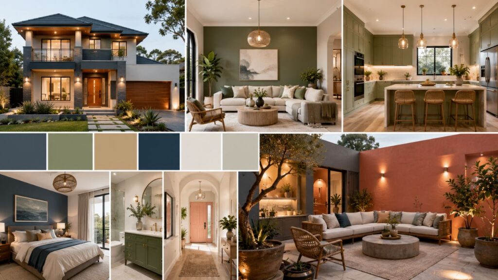
Simple Wall Paint Colour Combinations That Work in Any Room
Simple wall paint colour combination choices don’t require a design degree. They require understanding a few principles that professional designers use consistently across every project.
The 60-30-10 rule is the most practical framework for any room: 60% dominant color (walls), 30% secondary color (large furniture, rugs), 10% accent color (cushions, artwork, accessories). This ratio creates visual balance without requiring precise color matching. The dominant wall color sets the tone; the secondary and accent colors add depth and personality.
Neutral Foundations With Tonal Accents
The most versatile approach to wall color in any room is a neutral foundation with tonal accents — colors from the same family but at different depths. A warm greige (gray-beige) on three walls paired with a deeper terracotta or warm brown on a single feature wall creates visual interest without the commitment of a bold all-over color.
This approach works particularly well in living rooms and bedrooms where you want the space to feel calm and cohesive rather than stimulating. The tonal relationship between the colors creates harmony; the depth difference creates dimension.
Two Colour Combination for Walls: The Feature Wall Approach
The two colour combination for walls strategy — one neutral and one accent — remains one of the most effective ways to add personality to a room without overwhelming it. The key is choosing colors that share an undertone rather than colors that simply appear on the same paint brand’s “complementary” card.
For example: a soft sage green paired with a warm cream shares earthy, muted undertones that create a cohesive, organic feel. A cool charcoal paired with a crisp white shares cool, clean undertones that create a contemporary, graphic feel. Combinations that work share a tonal relationship — they feel like they belong to the same world.
Practical two-color combinations that consistently work across different room types:
- Warm white + soft navy: Classic, versatile, works in kitchens, bathrooms, and bedrooms
- Greige + deep forest green: Organic and grounding, particularly effective in living rooms
- Light gray + charcoal: Contemporary and clean, works in home offices and modern living spaces
- Cream + terracotta: Warm and inviting, excellent in dining rooms and entryways
- Pale blue + warm white: Fresh and airy, ideal for bathrooms and coastal-style bedrooms
Living Room Color Ideas That Go Beyond the Obvious
The living room is the most scrutinized room in most homes — it’s where guests form their first impression of your taste, and where your family spends the most time together. Living room color ideas that work long-term share one quality: they feel intentional rather than trendy.
The Case for Warm Neutrals
Warm neutrals — creamy whites, soft taupes, warm greiges — dominate living room color choices in American homes for a reason. They’re forgiving, they work with a wide range of furniture styles and wood tones, and they don’t date the way bolder colors can. Benjamin Moore’s Pale Oak (OC-20) and Sherwin-Williams’ Accessible Beige (SW 7036) are two of the most consistently recommended living room colors by interior designers precisely because they perform reliably across different lighting conditions and furniture combinations.
The risk with warm neutrals is that they can feel flat or uninspired without deliberate attention to texture and layering. Linen curtains, a jute rug, textured throw pillows, and natural wood accents give a neutral living room the depth it needs to feel curated rather than cautious.
Bold Color in the Living Room: When It Works
Bold living room colors — deep navy, forest green, terracotta, warm black — work when the room has sufficient natural light and when the furniture and flooring provide enough contrast to prevent the space from feeling heavy. A living room with large south-facing windows can handle a deep color on all four walls in a way that a north-facing room simply can’t.
If you love a bold color but your living room doesn’t have ideal light, apply it to a single wall — typically the wall behind the sofa or the fireplace wall — and keep the remaining three walls in a lighter tonal companion. You get the drama without the darkness.
Home Colour Design for Open-Plan Living Spaces
Open-plan spaces present a specific home colour design challenge: how do you create visual definition between zones — kitchen, dining, living — without using walls to separate them? The answer is usually flooring transitions, furniture placement, and subtle color shifts rather than dramatic color changes.
In open-plan spaces, keeping the wall color consistent across zones while varying the accent colors and textiles in each zone creates cohesion with enough variation to define the different areas. A consistent warm white on all walls, with navy accents in the living zone, terracotta in the dining zone, and natural wood tones in the kitchen, creates a unified palette that still feels distinct in each area.
Asian Paints Colour Combination With Code: A Practical Reference
For homeowners working with Asian Paints — one of the most widely used paint brands in South Asian markets and increasingly available in specialty stores across the USA — understanding the Asian Paints colour combination with code system makes color selection significantly more precise.
Asian Paints organizes its colors using a numerical code system that allows for exact replication across different batches and locations. Some of the most popular combinations with their codes include:
- Ivory Cream (8187) + Terracotta Brown (8282): A warm, traditional combination that works well in living rooms and dining spaces
- Aqua Splash (7424) + Pristine White (8282): Fresh and contemporary, ideal for bathrooms and kitchens
- Sage Green (6854) + Warm Beige (8178): Organic and calming, excellent for bedrooms
- Charcoal (0538) + Light Gray (7770): Modern and sophisticated, works in home offices and contemporary living rooms
- Dusty Rose (1337) + Soft White (8001): Warm and feminine, popular in bedrooms and nurseries
When using the Asian Paints code system, always request a physical sample card with the specific code rather than relying on digital representations. Screen colors vary significantly from printed and applied colors, and the code system is only as reliable as the physical reference you’re working from.
Exterior House Paint: The Decisions That Define Your Home’s First Impression
Exterior house paint is the most visible color decision you’ll make — visible to every neighbor, every visitor, and every potential buyer. It’s also the most weather-dependent, UV-exposed, and structurally demanding application paint will face. The stakes are higher than any interior color decision, and the margin for error is smaller.
Understanding Exterior House Colors and Architectural Style
The most successful exterior house colors work with the architectural style of the home rather than against it. A Victorian home with ornate trim and multiple architectural details can support a more complex color palette — three or even four colors across body, trim, accent, and door. A mid-century modern home with clean lines and minimal ornamentation typically looks best with a simpler two-color approach: a strong body color and a contrasting or complementary trim.
House colors that ignore architectural context — a bright turquoise on a traditional colonial, for example, or a stark white on a craftsman bungalow with warm wood details — tend to look jarring rather than distinctive. The goal is a color that makes the home look more like itself, not less.
Sherwin Williams Exterior Paint Colors: The Professional Standard
Sherwin Williams exterior paint colors are among the most widely specified by architects and contractors in the United States, and for good reason. The brand’s Duration and Emerald exterior lines offer exceptional durability, UV resistance, and color retention — qualities that matter enormously on a surface exposed to direct sunlight, rain, and temperature fluctuation year-round.
Some of the most consistently recommended Sherwin Williams exterior paint colors include:
- Alabaster (SW 7008): A warm, creamy white that works across architectural styles
- Repose Gray (SW 7015): A versatile cool gray that reads as sophisticated without being stark
- Naval (SW 6244): A deep navy that has become one of the most popular bold exterior choices of the past five years
- Evergreen Fog (SW 9130): A muted sage green that was Sherwin-Williams’ 2022 Color of the Year and remains widely popular
- Urbane Bronze (SW 7048): A warm, earthy brown-gray that works particularly well on craftsman and contemporary homes
Best exterior paint performance from Sherwin-Williams comes from their Emerald Exterior line, which offers the highest durability rating in the brand’s lineup and is worth the premium cost for surfaces that receive direct sun exposure.
Modern Exterior House Paint Colors: What’s Leading in 2025 and Beyond
Modern exterior house paint colors have shifted significantly over the past several years, moving away from the beige and tan dominance of the 2000s toward a more varied palette that includes deeper, more saturated tones alongside sophisticated neutrals.
The 2026 Exterior House Colors Forecast
2026 exterior house colors are trending toward what designers are calling “grounded naturals” — colors drawn from the earth, stone, and organic materials rather than from the cool gray palette that dominated the previous decade. Warm taupes, clay tones, muted terracottas, and deep olive greens are all gaining significant traction in residential exterior design.
The shift reflects a broader cultural movement toward warmth, authenticity, and connection to natural materials — a reaction, in part, to the cool minimalism that defined the 2010s. Homes painted in these warmer, earthier tones tend to feel more permanent and rooted in their landscape, which resonates with homeowners who are thinking about long-term livability rather than short-term trend alignment.
Modern house colors that are gaining momentum for 2026 include:
- Warm clay and terracotta tones: Particularly popular in the Southwest and Mediterranean-influenced architecture
- Deep olive and forest green: Moving from interior accent to full exterior application
- Warm charcoal and soft black: Continuing the bold dark exterior trend with warmer undertones replacing the cooler blacks of recent years
- Creamy off-whites: Replacing stark whites as the neutral of choice, particularly on homes with warm wood or stone accents
- Dusty blue-gray: A softer alternative to navy that works across a wider range of architectural styles
Modern Exterior House Paint Colors Photo Gallery: What to Look For
When browsing a modern exterior house paint colors photo gallery — whether on a paint brand’s website, Houzz, or Pinterest — train yourself to look beyond the color itself and evaluate the complete picture. Notice the trim color and how it relates to the body color. Notice the door color and whether it reads as an accent or a continuation of the palette. Notice the landscaping and hardscaping and how the paint color interacts with those elements.
The most useful photo gallery images show the home in natural daylight — ideally both morning and afternoon light — rather than in the golden-hour photography that makes almost any color look beautiful. Real-world performance in ordinary light is what you’re actually buying.
Choosing the Best Exterior Paint: Quality, Durability, and Value
Best exterior paint selection involves more than choosing a color. The paint’s formulation — its binder, pigment quality, and additive package — determines how long the color holds, how well it resists moisture and UV degradation, and how much surface preparation it requires.
What Separates Premium Exterior Paint From Budget Options
Premium exterior paints — Sherwin-Williams Emerald, Benjamin Moore Aura Exterior, Behr Marquee Exterior — use higher-quality acrylic binders that maintain flexibility as temperatures fluctuate, preventing cracking and peeling. They also use higher-concentration pigments that resist UV fading more effectively than budget formulations.
The cost difference between premium and budget exterior paint is typically $20 to $40 per gallon. On a full exterior paint job that might use 10 to 15 gallons, that’s $200 to $600 in additional material cost. Against a total labor and material cost of $3,000 to $8,000 for a professional exterior paint job, the premium paint upgrade is almost always worth it — it extends the repaint cycle from 5 to 7 years to 10 to 15 years.
Color Paint Finish Selection for Exteriors
Color paint finish selection matters as much as color selection for exterior applications. The general guidance:
- Flat or matte finish: Hides surface imperfections well but is harder to clean and less durable — best for rough or textured surfaces like stucco
- Satin finish: The most popular exterior finish — provides a slight sheen, good durability, and reasonable cleanability
- Semi-gloss finish: Best for trim, doors, and architectural details — provides high durability and a clean, crisp appearance that highlights architectural features
- Gloss finish: Reserved for front doors and specific accent elements — provides maximum durability and a high-impact appearance
Most professional painters recommend satin for the body of the home and semi-gloss for all trim, regardless of the color palette chosen.
Exterior paint colors in darker shades absorb more heat than lighter colors, which can accelerate paint degradation in climates with intense sun exposure. In hot, sunny regions — the Southwest, Florida, Southern California — choosing a lighter body color or a paint formulated specifically for high-UV environments extends the paint’s lifespan meaningfully.
[IMAGE: Modern craftsman exterior house with warm clay body color, crisp white trim, and a deep forest green front door, photographed in natural afternoon light showing realistic color rendering]
Frequently Asked Questions
How do I choose a home colour that works with my existing flooring and furniture?
Start by identifying the dominant undertone in your flooring and largest furniture pieces. Warm wood floors with orange or red undertones pair best with warm wall colors — creams, warm grays, earthy greens. Cool gray or white flooring pairs better with cool wall colors — blue-grays, cool whites, soft blues. Bringing a physical sample of your flooring material to the paint store and holding it against paint chips in natural light is the most reliable way to identify compatible colors before committing.
What is the best way to test exterior house paint colors before painting the whole house?
Purchase sample quarts of your top two or three color choices and apply them directly to the exterior surface in a 2×2 foot section, ideally in a location that receives both morning and afternoon sun. Observe the samples over several days and in different weather conditions — overcast days reveal the true color more accurately than bright sunlight, which can wash out or intensify colors. Digital color visualization tools from brands like Sherwin-Williams and Benjamin Moore are useful for initial narrowing but should never replace physical samples on the actual surface.
How often does exterior house paint need to be replaced?
Premium exterior paint on a properly prepared surface typically lasts 10 to 15 years before requiring full repainting. Budget paint on the same surface may need repainting in 5 to 7 years. Signs that repainting is needed include visible fading, chalking (a powdery residue on the surface), cracking, peeling, or bubbling. Regular cleaning of the exterior surface — removing mildew, dirt, and oxidation — extends paint life significantly and is worth doing every 2 to 3 years regardless of the paint’s overall condition.
Can I use interior paint on exterior surfaces or vice versa?
Interior and exterior paints use different binder formulations designed for their specific environments. Exterior paint contains additives that resist UV degradation, moisture, mildew, and temperature fluctuation — additives that aren’t necessary indoors and that can off-gas in enclosed spaces. Interior paint lacks these additives and will fail quickly when exposed to outdoor conditions. Using the correct paint for each application isn’t optional — it’s the difference between a paint job that lasts a decade and one that fails within a year.
What are the most timeless exterior house colors that won’t look dated in 10 years?
Historically, the most timeless exterior colors are those drawn from natural materials — stone, wood, earth, and sky. Warm whites and creamy off-whites, soft grays with warm undertones, muted greens, and classic navy blues have all demonstrated staying power across multiple design cycles. Colors that tend to date quickly are those tied to a specific trend moment — the gray-beige dominance of the 2010s, for example, is already beginning to feel dated in some markets. Choosing a color with a clear natural reference point rather than a trend reference point is the most reliable path to long-term satisfaction.
How do I create a cohesive home colour design across multiple rooms?
The most effective approach is to establish a whole-home palette before choosing individual room colors — typically three to five colors that share undertone relationships and work together as a family. One or two neutrals form the foundation, used in hallways, ceilings, and transitional spaces. Two or three accent colors are distributed across individual rooms, with each room using the neutrals as a base and one accent as the dominant wall color. This creates visual flow as you move through the home without making every room look identical.
What is the difference between warm and cool exterior house paint colors, and how do I choose?
Warm exterior colors — creams, tans, terracottas, warm grays, olive greens — contain yellow, orange, or red undertones and tend to make a home feel welcoming and grounded. Cool exterior colors — bright whites, blue-grays, cool greens, slate — contain blue or green undertones and tend to make a home feel crisp and contemporary. The choice depends on your home’s architectural style, the surrounding landscape, and the neighborhood context. Homes surrounded by warm-toned landscaping and natural materials generally look better in warm colors; homes in urban or coastal settings often suit cooler palettes.
How do I choose a front door color that works with my exterior house colors?
The front door is the most visible accent element on any home’s exterior, and it should either complement or deliberately contrast with the body color. Complementary door colors share an undertone with the body color but sit at a different depth — a deep navy door on a light gray house, for example. Contrasting door colors use a color from the opposite side of the color wheel — a warm terracotta door on a cool gray house. Both approaches work; the key is that the door color should feel intentional rather than arbitrary. Red, black, and deep navy are the three most consistently successful front door colors across a wide range of exterior palettes.
The Colour Decisions That Define How Your Home Feels
Color is one of the few design elements that affects every person who enters a space — not just those who notice it consciously. The right home colour creates a feeling before anyone can articulate why. The wrong one creates a low-grade discomfort that’s equally hard to name but impossible to ignore.
What separates confident color decisions from regretful ones isn’t talent or design training. It’s process. Testing before committing. Understanding undertones before choosing. Considering the light, the architecture, and the surrounding context before falling in love with a chip. These habits are learnable, and they’re the difference between a paint job you’re proud of and one you’re already planning to redo.
Whether you’re refreshing a single living room wall or repainting your entire exterior, the principles in this guide apply equally. The scale changes; the thinking doesn’t. A home that’s been thoughtfully colored — inside and out — feels finished in a way that no amount of furniture or decoration can replicate. That’s the standard worth holding every color decision to.