
Introduction
There is something quietly magical about walking into a room painted blue. The right shade can make a bedroom feel softer, a kitchen feel fresher, or a living room feel like it finally learned how to breathe. That is why choosing the Best Blue Paint Colors matters more than simply picking a pretty swatch.
Blue is comforting, classic, and surprisingly flexible. It can feel coastal, traditional, modern, moody, bright, romantic, or crisp depending on undertones, lighting, and the surrounding finishes. Benjamin Moore highlights classic Hale Navy HC-154, Aegean Teal 2136-40, and November Skies 2128-50 among its popular blues, while Sherwin-Williams notes that pale blues can work beyond nurseries in laundry rooms, entryways, and more.
Whether you love airy coastal rooms or dramatic navy walls, this guide will help you understand blue paint colors in a real, practical way. We will look at undertones, lighting, room-by-room choices, designer-loved brands, and the difference between soft sky tones, smoky blue-gray shades, and deep saturated blues.
Why Blue Works So Well in Interior Design
Blue has a rare ability to feel both peaceful and polished. It is associated with water, sky, distance, freshness, and calm, which is why so many homeowners turn to blue when they want a room to feel restful without becoming boring.
The beauty of blue color is that it can shift dramatically. A pale powder blue can feel breezy and charming, while navy can feel elegant and grounded. A muted gray blue paint may read almost neutral, while a saturated cobalt can become the star of the whole room.
Understanding the Different Colors of Blue
When people talk about colors of blue, they are often describing much more than light or dark. They are talking about undertones. Some blues lean green, some lean gray, some lean purple, and some feel almost teal.
A shade of blue paint can look completely different from one home to another. Morning light may make it appear cooler, warm evening light may soften it, and artificial bulbs can pull out hidden gray, green, or violet notes.
Common Blue Families
Here are the main shades of blue you will see when shopping for paint:
- Pale blue: soft, airy, delicate, and often calming
- Sky blue: cheerful, open, and bright
- Blue-gray: muted, refined, and easy to decorate with
- Navy blue: rich, dramatic, and timeless
- Teal blue: lively, layered, and slightly green
- Dusty blue: soft, vintage-inspired, and cozy
- Slate blue: grounded, sophisticated, and flexible
These blue shades are not just decorative labels. They help you predict how a color will behave on your walls.
Best Blue Paint Colors for a Calm, Beautiful Home
The Best Blue Paint Colors are not always the boldest or trendiest. They are the ones that support the mood you want, work with your lighting, and complement your floors, fabrics, cabinets, and trim.
For most homes, the safest winners are balanced blues: not too icy, not too bright, not too muddy. Look for blues with enough softness to live with every day, especially in rooms where you spend a lot of time.
Light and Airy Blues
Light blue paint colors are perfect when you want a room to feel open and gentle. They work especially well in bedrooms, bathrooms, laundry rooms, nurseries, and small spaces that need visual breathing room.
Sherwin-Williams lists options like Dew Drop SW 9641 and Sky High SW 6504 among pale blue choices, noting that light blues can create relaxing spaces in laundry rooms and entryways.
Good light blues usually have a touch of gray or green in them. That small amount of softness keeps the walls from looking too sugary or overly bright.
Soft Sky Blues
A sky blue wall paint design can make a room feel fresh and optimistic. This works beautifully in sunrooms, children’s rooms, beach-inspired interiors, breakfast nooks, and bathrooms.
To keep sky blue from feeling too playful, pair it with warm whites, natural oak, rattan, linen, soft brass, or creamy stone. The warmth balances the coolness and gives the room a more grown-up feeling.
Warm Blues That Feel Inviting
Many people worry that blue will feel cold, but warm blue paint colors solve that problem beautifully. These blues often contain hints of green, teal, or muted gray, which makes them feel more comfortable and less icy.
Sherwin-Williams describes Niebla Azul SW 9137 as a serene dusty blue and Powder Blue SW 2863 as a versatile historic hue, placing both within its warm blue paint guidance.
Warm blues are excellent in living rooms, bedrooms, dining rooms, and home offices because they feel relaxed without feeling sleepy.
Choosing Blue by Undertone
Undertone is the secret behind every successful paint choice. A blue may look perfect on a sample card, then seem too purple, too green, or too gray once it is on your wall.
Before choosing from the Best Blue Paint Colors, compare each sample against white paper, your flooring, your furniture, and your trim. This makes the undertone easier to see.
Blue with Gray Undertones
A gray blue paint is one of the easiest blues to use because it behaves almost like a neutral. It has personality, but it rarely overwhelms a space.
This family is especially useful if your home has stone fireplaces, gray sofas, black fixtures, brushed nickel, marble, concrete, or cool-toned flooring.
Blue with Green Undertones
Blue-green shades feel organic, fresh, and slightly coastal. They can look like sea glass, teal, robin’s egg blue, or deep ocean blue depending on the depth.
These are beautiful choices for kitchens, bathrooms, mudrooms, and spaces with natural textures.
Blue with Purple Undertones
Some blues contain a quiet violet cast. These shades can feel elegant and romantic, but they need careful testing because purple undertones often become stronger in cool northern light.
If you want a refined bedroom or formal sitting room, this undertone can be lovely. Just avoid pairing it with very yellow trim unless you enjoy strong contrast.
Benjamin Moore Blues Worth Considering
If you are exploring benjamin moore blues, you will find a wide range of soft, smoky, classic, and dramatic options. Benjamin Moore’s official blue color page identifies Hale Navy HC-154, Aegean Teal 2136-40, and November Skies 2128-50 among its popular blue paint colors.
The brand’s wider paint color library also includes many vivid and layered blue options, including Windmill Wings 2067-60, Summer Blue 2067-50, Blue Lapis 2067-40, Twilight Blue 2067-30, Starry Night Blue 2067-20, and Midnight Navy 2067-10.
Benjamin Moore Blue Paint Colors for Classic Rooms
Benjamin Moore blue paint colors often work well in traditional and transitional homes because many of the shades have depth rather than harsh brightness.
Consider these types of rooms:
- Hale Navy-style blues for libraries, dining rooms, and cabinetry
- Aegean Teal-style blues for kitchens and accent walls
- Soft gray-blues for bedrooms and bathrooms
- Mid-tone dusty blues for built-ins, doors, and powder rooms
The best approach is to choose three samples: one light, one medium, and one deep. Paint them on large boards and move them around the room for two full days.
Sherwin-Williams Blues and Blue-Grays
Sherwin-Williams offers a wide blue family, from pale and fresh to deep and stormy. Its blue paint collection includes shades such as Snowdrop SW 6511, Sky High SW 6504, Blue Horizon SW 6497, Bravo Blue SW 6784, and Iceberg SW 6798.
For homeowners who want softness and versatility, sherwin williams blue gray paint is especially useful. These shades often feel sophisticated without becoming too dark.
Sherwin Williams Blue Gray Colors for Modern Homes
Sherwin Williams blue gray colors can look beautiful in rooms with modern farmhouse, coastal, Scandinavian, transitional, or organic modern styling.
They work well with:
- Warm white walls or trim
- Black windows and hardware
- Light oak flooring
- Cream upholstery
- Natural stone
- Woven shades
- Antique brass lighting
A muted blue-gray can also make a home office feel focused and calm.
Sherwin Williams Blue Grey Colors for Soft Contrast
Some homeowners search for sherwin williams blue grey colors because they want blue with a softer, more neutral appearance. The spelling may differ, but the goal is usually the same: a color that reads blue without feeling bright.
A blue grey paint can be a wonderful compromise when one person wants blue and another person wants gray. It gives you color, but it still feels grounded.
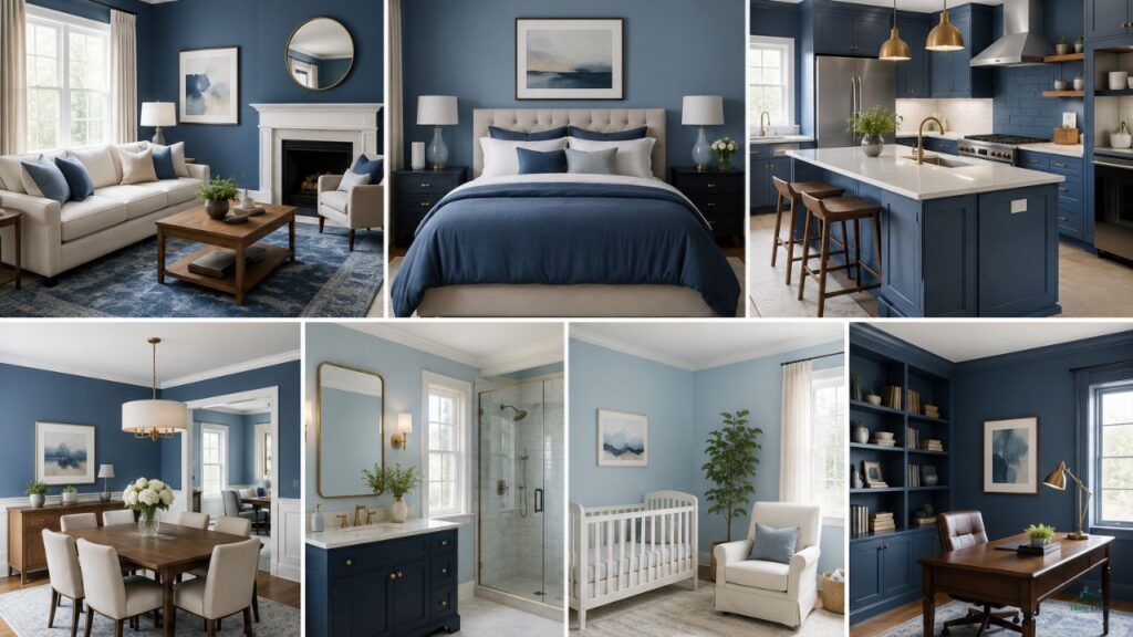
Best Blue Paint Colors by Room
The Best Blue Paint Colors depend heavily on the room. A shade that looks charming in a powder bath may feel too intense in an open living area. A soft bedroom blue may disappear in a bright kitchen.
Think about how you use each space before choosing the color. Restful rooms need softness. Social rooms can handle more energy. Small rooms can go either light and airy or dark and dramatic.
Blue Bedroom Paint Colors
Blue bedroom paint colors are popular for a reason. Blue naturally supports a peaceful mood, especially when it has gray, green, or muted undertones.
For bedrooms, avoid overly electric blues unless you want a lively, youthful feel. Most adults prefer restful shades like misty blue, dusty blue, slate blue, soft navy, or blue-gray.
Good bedroom pairings include:
- Blue-gray walls with white bedding
- Dusty blue walls with walnut furniture
- Pale blue walls with cream linen curtains
- Navy accent wall with warm brass lighting
- Teal-blue walls with woven textures
The goal is not just to choose a nice color. The goal is to create a room that helps you exhale.
Blue Living Room Paint Ideas
A living room can handle many popular blue paint colors, but the best choice depends on the natural light and furniture.
If your living room has large windows, a deeper blue can feel rich and balanced. If the room is small or shaded, a lighter muted blue may be easier to live with.
For a timeless look, pair blue walls with warm neutrals: oatmeal, ivory, camel, cognac leather, aged brass, oak, and natural fiber rugs.
Blue Kitchen Cabinet Colors
Blue cabinets are stylish because they add color without feeling trendy in the wrong way. Navy lower cabinets, slate blue islands, and muted teal pantries can all feel classic when paired with the right finishes.
For kitchens, test paint next to countertops, backsplash tile, flooring, and metal finishes. A blue that looks perfect alone may clash with creamy quartz or warm beige tile.
Blue Bathroom Paint Colors
Bathrooms are natural homes for blue because the color connects beautifully with water, tile, glass, and polished metal.
Pale blue can feel spa-like. Blue-gray can feel elegant. Navy can feel dramatic in a powder room, especially with wallpaper, brass sconces, and a stone vanity.
How Lighting Changes Blue Paint
Lighting can make or break blue. This is why small paint chips are not enough. You need large samples in the actual room.
North-facing rooms often make blue feel cooler and grayer. South-facing rooms usually make blue feel brighter and warmer. East-facing rooms may look fresh in the morning but cooler later. West-facing rooms may warm up dramatically in the afternoon.
Artificial Light Matters Too
Bulbs change everything. Warm bulbs can soften blue, while cool bulbs can make it feel sharper. Before committing to any blue colour paint, look at your sample under the lighting you actually use at night.
This is especially important in bedrooms, bathrooms, and kitchens because those rooms rely heavily on artificial light.
How to Pair Blue Paint with Trim and Ceilings
White trim is the most common partner for blue, but not every white works. A cool blue with a creamy yellow-white trim may create an awkward contrast. A warm muted blue with a stark white trim may feel too crisp.
For most Best Blue Paint Colors, soft whites, warm whites, and gentle off-whites are safer than icy whites. If your blue is very gray, a clean white can work beautifully. If your blue is warm or teal-leaning, choose a slightly warmer trim.
Should the Ceiling Be White or Blue?
White ceilings keep the room open and familiar. Blue ceilings create a more designed, enveloping effect.
In small rooms, painting the ceiling the same blue as the walls can actually make the space feel smoother because it removes harsh lines. This works especially well in powder rooms, offices, and cozy bedrooms.
Blue Paint and Home Style
Different homes call for different blues. The architecture, age, flooring, and furnishings all matter.
A historic home may look beautiful with dusty or heritage-inspired blues. A beach cottage can handle sky blue, watery blue, and soft teal. A modern home may look best with smoky blue-gray, deep navy, or clean mid-tone blue.
Traditional Homes
Traditional spaces often love navy, slate, dusty blue, and muted teal. These colors pair well with millwork, antique furniture, patterned rugs, and classic art.
Modern Homes
Modern interiors usually benefit from cleaner blues or sophisticated blue-grays. Keep contrast intentional with black, white, oak, and stone.
Coastal Homes
Coastal homes are perfect for pale sky blue, sea-glass blue, blue-green, and soft navy. Avoid making every detail blue. Mix in sand, linen, driftwood, and warm white.
Mistakes to Avoid When Choosing Blue Paint
Blue is beautiful, but it can be tricky. The biggest mistake is choosing from a tiny chip in a store aisle. Paint always changes at home.
Another common mistake is ignoring fixed finishes. Your floors, counters, tile, and fireplace stone are already part of the palette. The blue has to work with them, not just with your Pinterest board.
Watch Out for These Problems
- A blue that turns babyish in bright light
- A navy that looks black at night
- A gray-blue that becomes dull in a shaded room
- A teal that clashes with cool gray flooring
- A sky blue that feels too sweet with ornate furniture
- A blue-gray that makes beige carpet look yellow
Testing solves most of these problems before they become expensive.
How to Test Blue Paint Like a Designer
Paint samples on poster board instead of directly on the wall. This lets you move the sample around and compare it in different places.
Look at the sample in morning, afternoon, evening, and nighttime lighting. Hold it next to trim, flooring, fabric, cabinets, and countertops.
Use the Three-Sample Rule
Choose three versions of the same idea:
- One lighter than you think you want
- One at the depth you originally liked
- One slightly darker or grayer
This keeps you from locking onto the first pretty color too quickly.
Decorating with Blue Paint
Blue is easy to decorate with because it plays well with so many materials. It looks crisp with white, cozy with cream, earthy with wood, glamorous with brass, and modern with black.
If your room feels too cool after painting it blue, add warmth through texture. Think woven shades, warm wood, tan leather, brass frames, terracotta pottery, oatmeal rugs, and cream upholstery.
Best Accent Colors for Blue Walls
Try these combinations:
- Blue + warm white + oak
- Blue + cream + brass
- Blue + camel leather + black
- Blue-gray + ivory + walnut
- Navy + white + antique gold
- Sky blue + rattan + linen
- Teal-blue + rust + natural wood
These combinations keep blue from feeling flat or cold.
Best Blue Paint Colors for Small Spaces
Small rooms do not always need light paint. Sometimes deep blue makes a small room feel intentional and jewel-like.
Powder rooms, reading nooks, mudrooms, and compact offices can handle drama. A dark blue on walls, trim, and ceiling can feel elegant rather than cramped.
For small bedrooms or hallways, a muted light blue may be better if you want softness and openness.
Best Blue Paint Colors for Exteriors
Blue can also work beautifully outside, especially on front doors, shutters, porch ceilings, and siding.
For exteriors, remember that sunlight makes colors appear lighter and brighter. A blue that looks rich indoors may look much softer outside. Deeper, grayer blues often hold up better visually in strong daylight.
Exterior Pairings That Work
- Navy door with white siding
- Slate blue siding with cream trim
- Soft blue porch ceiling with warm white exterior
- Blue-gray shutters with stone or brick
- Teal-blue door with natural wood accents
Always test exterior blue on more than one side of the home because sunlight exposure changes the color dramatically.
FAQ
What are the Best Blue Paint Colors for bedrooms?
The Best Blue Paint Colors for bedrooms are usually soft, muted, and slightly warm or gray-based. Look for dusty blue, blue-gray, pale sky blue, slate blue, or gentle navy if you want a calm and restful mood.
Are warm blue paint colors better than cool blues?
Warm blue paint colors are often easier to live with because they feel softer and less chilly. Cool blues can be beautiful too, especially in bright rooms, but they need careful pairing with trim, flooring, and lighting.
What is the difference between gray blue paint and blue grey paint?
Gray blue paint and blue grey paint usually describe the same type of color: blue softened with gray. The result is quieter, more neutral, and easier to decorate with than a bright pure blue.
Which Benjamin Moore blues are popular?
Some popular benjamin moore blue paint colors include Hale Navy HC-154, Aegean Teal 2136-40, and November Skies 2128-50, which Benjamin Moore lists among its popular blue choices.
What Sherwin-Williams blues work well in calm rooms?
For calm rooms, consider soft or dusty options from Sherwin-Williams’ blue family. The brand references Niebla Azul SW 9137 as serene and Powder Blue SW 2863 as a versatile historic hue in its warm blue guidance.
Are light blue paint colors only for nurseries?
No. Light blue paint colors can work beautifully in adult bedrooms, bathrooms, laundry rooms, entryways, and kitchens. The key is choosing a muted or slightly grayed version so it feels refined.
How do I keep blue walls from feeling cold?
Balance blue walls with warm whites, wood tones, brass, woven textures, cream fabrics, and soft lighting. Choosing warmer undertones also helps.
What blue paint works best with white trim?
Most blues work with white trim, but the undertone matters. Cool blues look crisp with cleaner whites, while warm or teal blues usually look better with soft white or warm white trim.
Should I use dark blue in a small room?
Yes, if you want drama and depth. Dark blue can make a small powder room, office, or reading nook feel intentional and cozy. Use good lighting and repeat the color in decor for balance.
Conclusion
Choosing blue paint is not about finding one universally perfect color. It is about finding the blue that belongs in your room, with your light, your furniture, your flooring, and the feeling you want to create.
The Best Blue Paint Colors can make a home feel calmer, fresher, richer, or more personal. Start with the mood, study the undertones, test large samples, and let the room guide the final choice. When blue is chosen thoughtfully, it never feels random. It feels like the home finally found its voice.